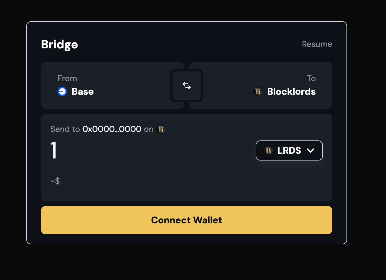
Base Appchains offer builders dedicated blockspace with powerful customization options including: custom gas tokens, sequencer-fee logic, and contract allowlisting. OnchainKit’s Bridge component is equally flexible allowing you to craft a branded bridge experience. In this guide, you’ll use AI to generate a color palette based on your brand and apply it as a custom theme across all OnchainKit components.
This tutorial assumes you have already deployed a Base Appchain and installed OnchainKit (version ≥ 0.38.7).
Objectives
By the end of this guide, you will be able to:
- Use an LLM to generate a brand-aligned color palette in the OnchainKit CSS format.
- Replace your project’s
globals.css with the AI-generated theme.
- Configure your Next.js layout to import the custom CSS and enable light/dark modes.
- Update the OnchainKit provider to use your custom theme.
Prerequisites
- A deployed Base Appchain
- OnchainKit (version ≥ 0.38.7) installed
- Access to an AI LLM that can process prompts
- Familiarity with Next.js, TypeScript, and CSS
Generate a Color Palette Using AI (optional)
Use the OnchainKit BoilerplateAttach your globals.css example from the OnchainKit docs. You can find the boilerplate here. I have provided a `global.css` file and a screenshot that represents the design themes for my React application. Based on these resources, please generate a complete CSS file as a markdown-formatted code block that includes a detailed color palette meeting the following criteria:
1. Define variables for primary, secondary, accent, and background colors.
2. Ensure all text elements have sufficient contrast against their background colors to maximize readability and conform to accessibility standards (e.g., WCAG guidelines).
3. Support both light mode and dark mode by including separate variables or media queries as needed to switch themes dynamically.
4. Optionally, include comments within the CSS code that explain how these colors relate to different UI elements or how the dark/light mode is implemented.
/* globals.css from OnchainKit CSS Boilerplate  */

/* Custom Theme – Light Mode */
.custom-light {
  /* Font and Shape */
  --ock-font-family: 'DM Sans', sans-serif;
  --ock-border-radius: 0.5rem;
  --ock-border-radius-inner: 0.375rem;
  /* Text Colors */
  --ock-text-foreground: #0d1117;
  /* …other variables… */
}

/* Custom Theme – Dark Mode */
.custom-dark {
  /* Font and Shape */
  --ock-font-family: 'DM Sans', sans-serif;
  /* …other variables… */
}
Replace Your Global CSS
This guide assumes you have already bootstrapped your project with the OnchainKit Boilerplate. If not, you can do so by running:
# Terminal
npm create onchain@latest
# Terminal
cd [YOUR-APP-DIRECTORY]
app/globals.css with the AI-generated CSS.
Confirm you’re importing globals.css in your root layout (layout.tsx):
// layout.tsx
import '@coinbase/onchainkit/styles.css';
import './globals.css';
layout.tsx, wrap your <html> tag with the light-mode class and apply your background variable:
// layout.tsx
export default function RootLayout({ children }: { children: React.ReactNode }) {
  return (
    <html lang="en" className="light">
      <body className="bg-background">
        <Providers>{children}</Providers>
      </body>
    </html>
  );
}
Enable Your Custom Theme in OnchainKit Provider
Open app/providers.tsx and update the provider’s appearance settings:
// app/providers.tsx
return (
    <OnchainKitProvider
      apiKey={process.env.NEXT_PUBLIC_ONCHAINKIT_API_KEY}
      chain={base}
      config={{
        appearance: {
          mode: 'auto',
          theme: 'custom',
        },
      }}
    >
      {props.children}
    </OnchainKitProvider>
  );
Run and Verify
Visit your local server (http://localhost:3000) and confirm:
- The CSS variables match your brand’s palette
- OnchainKit components including the Bridge widget reflect your custom theme
- Light and dark mode toggle correctly based on user settings
Conclusion
In this tutorial, you learned how to:
Use AI to generate a brand-aligned color palette for OnchainKit.
- Replace your globals.css with the AI-generated theme.
- Configure your Next.js layout and OnchainKit provider for theming.
- For more details, see the OnchainKit Custom Theme guide.
Happy building!