Overview

Build a complete React demo app from scratch to learn embedded wallets! This tutorial uses cdp-create-app to create a working app, then explains the key concepts and code.

Prerequisites

  • A free CDP Portal account and project
  • Node.js 22+
  • A node package manager installed (i.e., npm, pnpm, or yarn)
  • Basic familiarity with React and TypeScript
  • Configured your domain in CDP Portal (click to expand)
    1

    Access CDP Portal

    Navigate to the Domains Configuration in CDP Portal, and click Add domain to include your local app.
    Add domain dialog in CDP Portal
    2

    Add your domain

    • For local development: Use http://localhost:3000 (or your preferred port)
    • For production: Use your actual domain (e.g., https://yourapp.com)
    Domain configuration with localhost
    For production apps, only add your actual production domain. Do not add localhost to production CDP projects as malicious apps running locally could impersonate your frontend and abuse your project credentials.
    3

    Save your changes

    Click Add domain again to save your changes.
    Domain configuration saved in CDP Portal
    You should see your domain listed in the CDP Portal dashboard. The allowlist will take effect immediately upon saving.

Create the demo app

1

Copy your Project ID

Navigate to CDP Portal and select your project from the top-left dropdown. Clicking the gear icon will take you to your project details:
CDP Project ID in project settings
Copy the Project ID value. You will use this in the next step when configuring your demo app.
2

Create a new demo app

Use the latest version of create-cdp-app to create a new demo app. Replace <your-project-id> with your actual project ID from the previous step:
npm create @coinbase/cdp-app@latest cdp-app-react -- --template react --project-id <your-project-id>
3

Confirm domain whitelist

You will be prompted to confirm the localhost domain (which you should have already configured in the setup above):
✔ Confirm you have whitelisted 'http://localhost:3000' by typing 'y' … y
4

Run your app

Navigate to your project directory, install dependencies, and start the development server:
cd cdp-app-react
npm install
npm run dev
On successful startup, you should see similar to the following:
  VITE v7.0.5  ready in 268 ms

  ➜  Local:   http://localhost:3000/
  ➜  Network: use --host to expose
  ➜  press h + enter to show help

Demo your new wallet

Now that your embedded wallet is configured and your app is running, let’s try it out.
1

Sign in

Head to http://localhost:3000 and click the Sign In button.
CDP React Demo Sign In
2

Enter your email

CDP React Demo Email
3

Verify

Enter the verification code sent to your e-mail.
CDP React Demo Verify
4

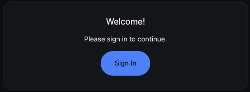
View your new wallet

Congrats! Your new embedded wallet has been created, authenticated, and is ready to use on the Base Sepolia network.From the demo app, you can copy-and-paste your wallet address from the top-right corner. You can also monitor your wallet balance and (eventually — keep reading!) send transactions. You should see similar to the following:
CDP React Demo Transaction
Find record of your new wallet on Base Sepolia explorer using the URL: 
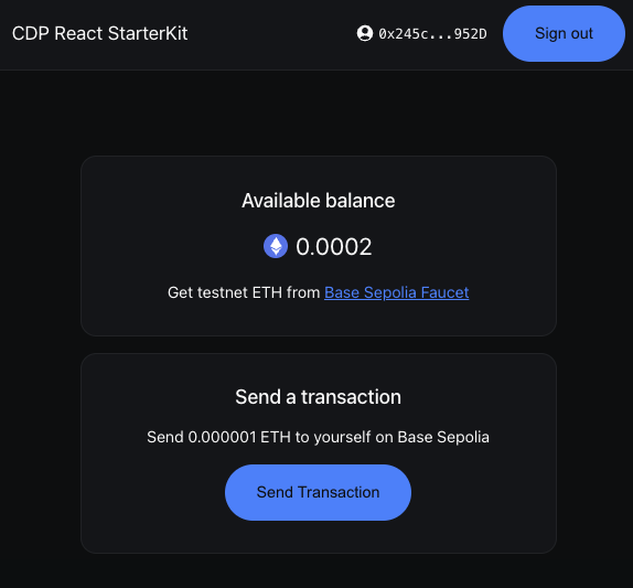
https://sepolia.basescan.org/address/YOUR-WALLET-ADDRESS.
5

Fund your wallet with testnet ETH

Before you can send transactions, you’ll need to fund your wallet with testnet ETH. Follow the link to request testnet funds from a Base Faucet.
CDP React Demo Fund Wallet
6

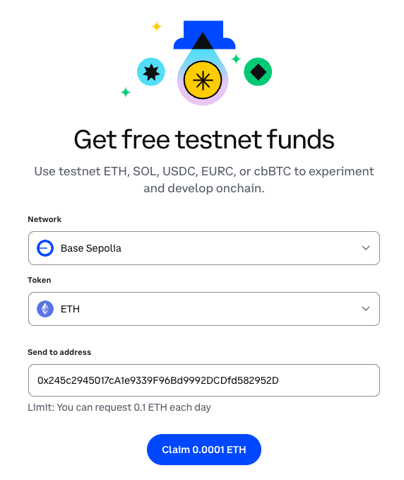
Send your first transaction

Now that your wallet has testnet ETH, you can send your first transaction! The demo app allows you to send 0.000001 ETH to yourself as a test.Click Send Transaction to initiate the transfer. Once complete, you’ll see a transaction hash that you can look up on the blockchain explorer.
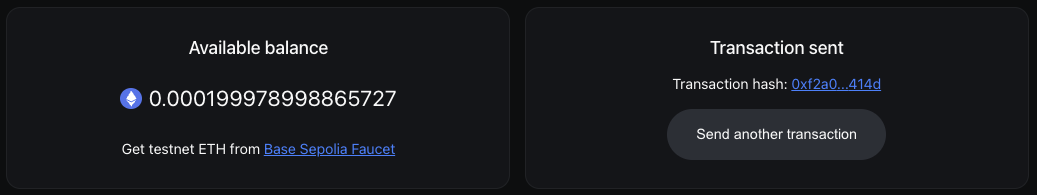
CDP React Demo Transaction
🎉 You’ve successfully created an embedded wallet and sent your first transaction! Try adding some React Hooks or additional components to expand your app.

How it works

Want to customize your app or understand how CDP makes wallets so simple? Let’s look at the key components that power your new embedded wallet.

File structure

The demo app is built with React and Vite, organized into these main files:
src/
├── App.tsx              # Main app component with authentication state
├── SignInScreen.tsx     # Sign-in UI component
├── SignedInScreen.tsx   # Post-authentication UI with balance tracking
├── Header.tsx           # Header with wallet address and auth button
├── Transaction.tsx      # Transaction sending component
├── UserBalance.tsx      # Balance display component
├── Loading.tsx          # Loading state component
├── Icons.tsx            # Icon components
├── config.ts            # CDP configuration
├── theme.ts             # Custom theme configuration
├── main.tsx             # Entry point
└── index.css            # Styles
You can explore the package for this demo in more detail at npmjs.com.

Entry point + provider setup

src/main.tsx demonstrates how to wrap your app with the CDPReactProvider to enable CDP functionality throughout the component tree.
src/main.tsx
import { CDPReactProvider } from "@coinbase/cdp-react";
import { StrictMode } from "react";
import { createRoot } from "react-dom/client";

import App from "./App.tsx";
import { APP_CONFIG, CDP_CONFIG } from "./config.ts";
import { theme } from "./theme.ts";
import "./index.css";

createRoot(document.getElementById("root")!).render(
  <StrictMode>
    <CDPReactProvider config={CDP_CONFIG} app={APP_CONFIG} theme={theme}>
      <App />
    </CDPReactProvider>
  </StrictMode>,
);
The CDP_CONFIG contains your Project ID from setup, stored securely in an environment variable (VITE_CDP_PROJECT_ID). By default the app creates an EVM EOA account for the user on sign in. To create a Smart Account, set createAccountOnLogin to evm-smart in the config. The APP_CONFIG contains metadata about your application:
  • name: Your app’s display name shown in the wallet UI
  • logoUrl: URL to your app’s logo displayed during authentication

Auth state management

src/App.tsx demonstrates how CDP simplifies wallet state management with two simple hooks:
src/App.tsx
import { useIsInitialized, useIsSignedIn } from "@coinbase/cdp-hooks";

import Loading from "./Loading";
import SignedInScreen from "./SignedInScreen";
import SignInScreen from "./SignInScreen";

function App() {
  const { isInitialized } = useIsInitialized();
  const { isSignedIn } = useIsSignedIn();

  return (
    <div className="app flex-col-container flex-grow">
      {!isInitialized && <Loading />}
      {isInitialized && (
        <>
          {!isSignedIn && <SignInScreen />}
          {isSignedIn && <SignedInScreen />}
        </>
      )}
    </div>
  );
}

export default App;
CDP provides these powerful hooks:
  • useIsInitialized(): Know when the SDK is ready (no manual provider checks!)
  • useIsSignedIn(): Instant auth status (no complex wallet connection state)
Unlike traditional Web3 apps that manage wallet providers, connection states, account changes, and network switches, CDP handles everything behind the scenes. Your app just checks if the user is signed in.

Sign-in interface

src/SignInScreen.tsx showcases how to provide the Sign in experience to your users.
src/SignInScreen.tsx
import { AuthButton } from "@coinbase/cdp-react/components/AuthButton";

function SignInScreen() {
  return (
    <main className="card card--login">
      <h1 className="sr-only">Sign in</h1>
      <p className="card-title">Welcome!</p>
      <p>Please sign in to continue.</p>
      <AuthButton />
    </main>
  );
}

export default SignInScreen;
The AuthButton component handles:
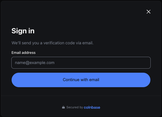
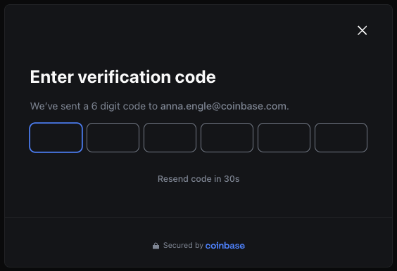
  • Email authentication: No seed phrases to manage - users maintain full control
  • Wallet creation: Automatically creates a self-custodial wallet on first sign-in
  • Session management: Handles tokens and persistence
  • UI/UX: Professional auth flow with email verification

The authenticated experience

src/SignedInScreen.tsx shows how to manage the authenticated session of a user. Two important hooks to highlight here:
  • useEvmAddress(): Fetch the user’s wallet address
  • useIsSignedIn(): Returns true if the user is signed in
For balance tracking, we query the blockchain using the user’s wallet address:
src/SignedInScreen.tsx
  const getBalance = useCallback(async () => {
    if (!evmAddress) return;
    
    // Query the blockchain for the user's evm address
    const balance = await client.getBalance({
      address: evmAddress,
    });
    setBalance(balance);
  }, [evmAddress]);

  // Refresh balance on mount and every 500ms
  useEffect(() => {
    getBalance();
    const interval = setInterval(getBalance, 500);
    return () => clearInterval(interval);
  }, [getBalance]);
Finally, we compose the authenticated UI to return the user’s balance:
src/SignedInScreen.tsx
  return (
    <>
      <Header />
      <main className="main flex-col-container flex-grow">
        <div className="main-inner flex-col-container">
          <div className="card card--user-balance">
            <UserBalance balance={formattedBalance} />
          </div>
          <div className="card card--transaction">
            {isSignedIn && evmAddress && (
              <Transaction 
                balance={formattedBalance} 
                onSuccess={getBalance}
              />
            )}
          </div>
        </div>
      </main>
    </>
  );
}

Sending transactions

src/Transaction.tsx demonstrates how to send ETH using CDP’s transaction hooks. Key CDP hooks to highlight here:
  • useSendEvmTransaction(): Sends transactions from the user’s address
  • useEvmAddress(): Gets the current user’s address
We create the transaction handler using CDP’s sendEvmTransaction:
src/Transaction.tsx
  const handleSendTransaction = useCallback(
    async (e: MouseEvent<HTMLButtonElement>) => {
      if (!evmAddress) return;

      e.preventDefault();
      setIsPending(true);

      const { transactionHash } = await sendEvmTransaction({
        transaction: {
          to: evmAddress,              // Send to yourself for testing
          value: 1000000000000n,       // 0.000001 ETH in wei
          gas: 21000n,                 // Standard ETH transfer gas limit
          chainId: 84532,              // Base Sepolia testnet
          type: "eip1559",             // Modern gas fee model
        },
        evmAccount: evmAddress,        // Your self-custodial wallet address
        network: "base-sepolia",       // Target network
      });

      setTransactionHash(transactionHash);
      setIsPending(false);
      onSuccess?.();
    },
    [evmAddress, sendEvmTransaction, onSuccess],
  );
Finally, the UI renders different content based on the transaction state:
src/Transaction.tsx
  return (
    <>
      {transactionHash ? (
        // Success state
        <>
          <h2>Transaction sent</h2>
          <a href={`https://sepolia.basescan.org/tx/${transactionHash}`}>
            {transactionHash.slice(0, 6)}...{transactionHash.slice(-4)}
          </a>
          <Button onClick={() => setTransactionHash(null)}>
            Send another transaction
          </Button>
        </>
      ) : (
        // Pre-transaction state (ready to send or needs funds)
        <>
          {hasBalance ? (
            <Button onClick={handleSendTransaction} isPending={isPending}>
              Send Transaction
            </Button>
          ) : (
            <p>Get testnet ETH from the faucet first!</p>
          )}
        </>
      )}
    </>
  );
The component intelligently handles different states:
  • Loading skeletons while fetching balance
  • Empty wallet state with faucet link
  • Ready state with send button
  • Success state with transaction hash and option to send another

Wallet management header

src/Header.tsx provides a clean interface for users to view their wallet address and manage their session.
src/Header.tsx
function Header() {
  const evmAddress = useEvmAddress();  // Get the user's address
  const [isCopied, setIsCopied] = useState(false);

  const copyAddress = async () => {
    await navigator.clipboard.writeText(evmAddress);
    setIsCopied(true);
    // Reset after 2 seconds
    setTimeout(() => setIsCopied(false), 2000);
  };

  return (
    <header>
      <h1>CDP React StarterKit</h1>
      <div className="user-info">
        {/* Copy wallet address button */}
        <button onClick={copyAddress}>
          {isCopied ? <IconCheck /> : <IconCopy />}
          <span>{evmAddress.slice(0, 6)}...{evmAddress.slice(-4)}</span>
        </button>
        
        {/* Sign out button */}
        <AuthButton />
      </div>
    </header>
  );
}
Key features:
  • Wallet display: Shows truncated address (e.g., 0x1234...5678)
  • Copy to clipboard: One-click copying with visual feedback
  • Session management: Sign out via CDP’s AuthButton

Balance display

src/UserBalance.tsx displays the user’s ETH balance with a helpful faucet link.
src/UserBalance.tsx
function UserBalance({ balance }: { balance?: string }) {
  return (
    <>
      <h2 className="card-title">Available balance</h2>
      <p className="user-balance">
        {balance === undefined && <LoadingSkeleton />}
        {balance !== undefined && (
          <span className="flex-row-container">
            <img src="/eth.svg" alt="" className="balance-icon" />
            <span>{balance}</span>
          </span>
        )}
      </p>
      <p>
        Get testnet ETH from{" "}
        <a href="https://portal.cdp.coinbase.com/products/faucet">
          Base Sepolia Faucet
        </a>
      </p>
    </>
  );
}
Key features:
  • Shows ETH balance with an icon
  • Loading skeleton while fetching balance
  • Direct link to the faucet for getting testnet funds

Theme customization

The demo app provides extensive theming capabilities through CSS variables and the CDP theme system, allowing you to fully customize the look and feel to match your brand.
src/theme.ts
export const theme: Partial<Theme> = {
  "colors-bg-default": "var(--cdp-example-card-bg-color)",
  "colors-bg-overlay": "var(--cdp-example-bg-overlay-color)",
  "colors-bg-skeleton": "var(--cdp-example-bg-skeleton-color)",
  "colors-bg-primary": "var(--cdp-example-accent-color)",
  "colors-bg-secondary": "var(--cdp-example-bg-low-contrast-color)",
  "colors-fg-default": "var(--cdp-example-text-color)",
  "colors-fg-muted": "var(--cdp-example-text-secondary-color)",
  "colors-fg-primary": "var(--cdp-example-accent-color)",
  "colors-fg-onPrimary": "var(--cdp-example-accent-foreground-color)",
  "colors-fg-onSecondary": "var(--cdp-example-text-color)",
  "colors-line-default": "var(--cdp-example-card-border-color)",
  "colors-line-heavy": "var(--cdp-example-text-secondary-color)",
  "colors-line-primary": "var(--cdp-example-accent-color)",
  "font-family-sans": "var(--cdp-example-font-family)",
  "font-size-base": "var(--cdp-example-base-font-size)",
  // ... maps to CSS variables defined in index.css
};
The app includes:
  • Dark mode support: Enables light and dark themes
  • Customizable colors: Primary accent, backgrounds, text, borders, and more
  • Typography control: Font family and base font size
  • Responsive breakpoints: Different styles for mobile, tablet, and desktop
  • Component theming: Style CDP components like buttons, inputs, and modals
All theme values are defined as CSS variables in index.css, making it easy to rebrand the entire app by updating a few color values. For more information on theme customization, see the theme customization documentation.