Overview

Build a dapp using Coinbase Developer Platform (CDP) embedded wallet in under 5 minutes! This guide shows you how to integrate our wallet infrastructure directly into your React application using our cdp-create-app package.
Check out the CDP Web SDK reference for comprehensive method signatures, types, and examples.

Prerequisites

  • A free CDP Portal account and project
  • Node.js 22+
  • A node package manager installed (i.e., npm, pnpm, or yarn)
  • Basic familiarity with React and TypeScript
Let’s get started by scaffolding a new React app with the necessary dependencies.

1. Add your domain

To begin, add your domain to the list of allowed domains in CDP Portal.
1

Access CDP Portal

Navigate to the Domains Configuration in CDP Portal, and click Add domain to include your local app.
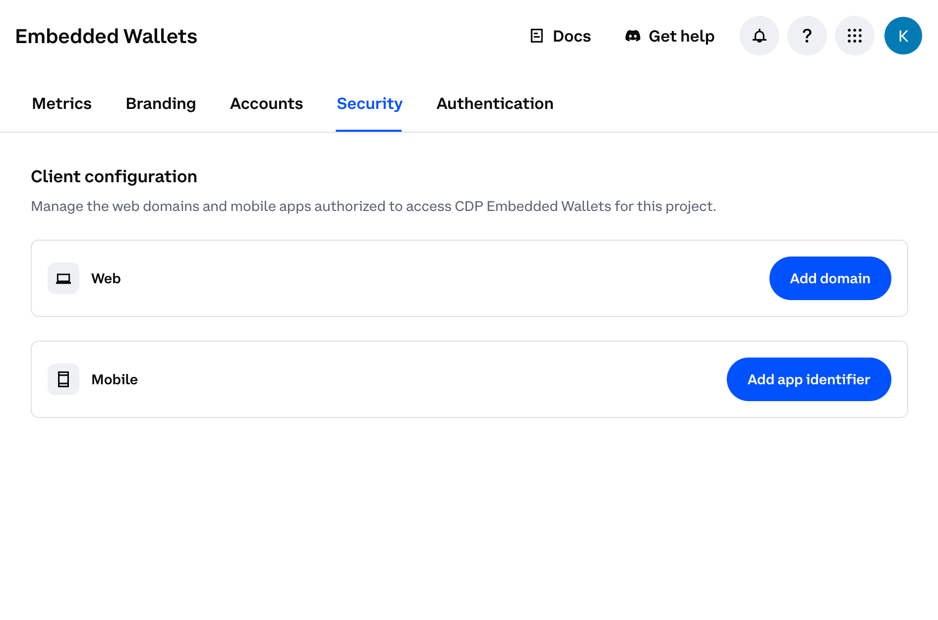
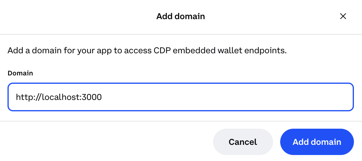
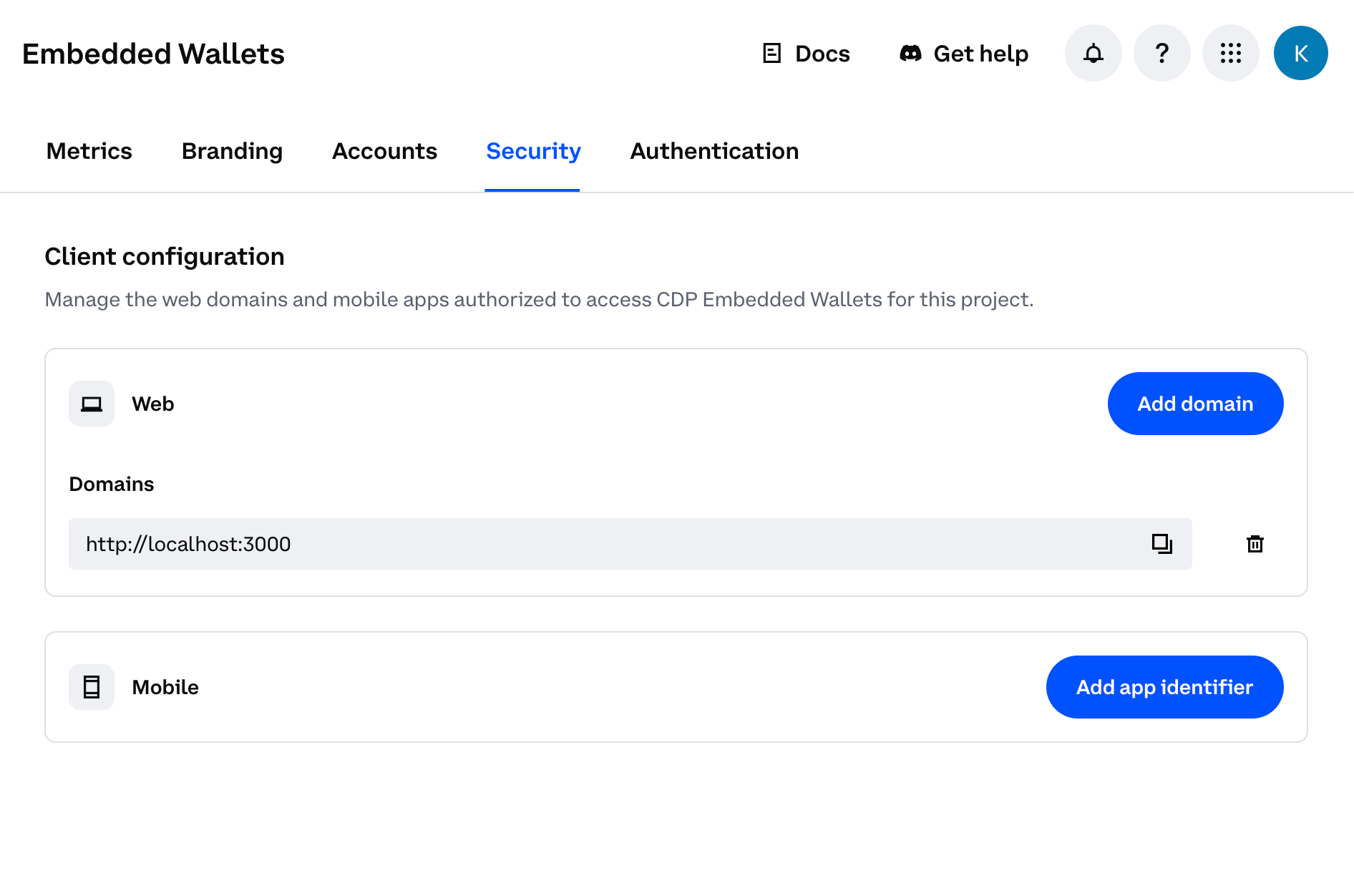
Add domain dialog in CDP Portal
2

Add your domain

Use http://localhost:3000 (the port your demo app will run locally).
Domain configuration with localhost
Do not do this in your CDP project intended for production use. Malicious apps running locally could impersonate your frontend and abuse your project credentials.
3

Save your changes

Click Add domain again to save your changes.
Domain configuration saved in CDP Portal
You should see your local app URL listed in the CDP Portal dashboard. The allowlist will take effect immediately upon saving.

2. Create the demo app

1

Create a new demo app

Use the latest version of cdp-app to create a new demo app using your package manager:
npm create @coinbase/cdp-app@latest
Let this run in the background and move on to the next step.
2

Copy your Project ID

While the app is being created, navigate to CDP Portal and select your project from the top-left dropdown. Clicking the gear icon will take you to your project details:
CDP Project ID in project settings
Copy the Project ID value. You will use this in the next step when configuring your demo app.

3. Configure

Follow the prompts to configure your app with an embedded wallet. Name your project, select React as a template, and enter your CDP Project ID that you copied in the previous step.
Ok to proceed? (y) y

> npx
> create-cdp-app

✔ Project name: … cdp-app-react
✔ Select a template: › React
✔ CDP Project ID (Find your project ID at https://portal.cdp.coinbase.com/projects/overview): … 8c21e60b-c8af-4286-a0d3-111111111111
✔ Confirm you have whitelisted 'http://localhost:3000' by typing 'y' … y

4. Run

Navigate to your project directory, install dependencies, and start the development server:
cd cdp-app-react
npm install
npm run dev
On successful startup, you should see similar to the following:
  VITE v7.0.5  ready in 268 ms

  ➜  Local:   http://localhost:3000/
  ➜  Network: use --host to expose
  ➜  press h + enter to show help

5. Demo your new wallet

Now that your embedded wallet is configured and your app is running, let’s try it out.
1

Sign in

Head to http://localhost:3000 and click the Sign In button.
CDP React Demo Sign In
2

Enter your email

CDP React Demo Email
3

Verify

Enter the verification code sent to your e-mail.
CDP React Demo Verify
4

View your new wallet

Congrats! Your new embedded wallet has been created, authenticated, and is ready to use on the Base Sepolia network.
From the demo app, you can copy-and-paste your wallet address from the top-right corner. You can also monitor your wallet balance and (eventually — keep reading!) send transactions. You should see similar to the following:
CDP React Demo Transaction
Find record of your new wallet on Base Sepolia explorer using the URL: https://sepolia.basescan.org/address/YOUR-WALLET-ADDRESS.
5

Fund your wallet with testnet ETH

Before you can send transactions, you’ll need to fund your wallet with testnet ETH. Follow the link to request testnet funds from a Base Faucet.
CDP React Demo Fund Wallet
6

Send your first transaction

Now that your wallet has testnet ETH, you can send your first transaction! The demo app allows you to send 0.000001 ETH to yourself as a test.Click Send Transaction to initiate the transfer. Once complete, you’ll see a transaction hash that you can look up on the blockchain explorer.
CDP React Demo Transaction
🎉 You’ve successfully created an embedded wallet and sent your first transaction! Try adding some React Hooks or additional components to expand your app.

How it works

Want to customize your app or understand how CDP makes wallets so simple? Let’s look at the key components that power your new embedded wallet. The demo app is built with React and Vite, organized into these main files:
src/
├── App.tsx              # Main app component with authentication state
├── SignInScreen.tsx     # Sign-in UI component
├── SignedInScreen.tsx   # Post-authentication UI with balance tracking
├── Header.tsx           # Header with wallet address and auth button
├── Transaction.tsx      # Transaction sending component
├── UserBalance.tsx      # Balance display component
├── Loading.tsx          # Loading state component
├── Icons.tsx            # Icon components
├── config.ts            # CDP configuration
├── theme.ts             # Custom theme configuration
├── main.tsx             # Entry point
└── index.css            # Styles
You can explore the package for this demo in more detail at npmjs.com.

Entry point + provider setup

src/main.tsx demonstrates how to wrap your app with the CDPReactProvider to enable CDP functionality throughout the component tree.
src/main.tsx
import { CDPReactProvider } from "@coinbase/cdp-react";
import { StrictMode } from "react";
import { createRoot } from "react-dom/client";

import App from "./App.tsx";
import { APP_CONFIG, CDP_CONFIG } from "./config.ts";
import { theme } from "./theme.ts";
import "./index.css";

createRoot(document.getElementById("root")!).render(
  <StrictMode>
    <CDPReactProvider config={CDP_CONFIG} app={APP_CONFIG} theme={theme}>
      <App />
    </CDPReactProvider>
  </StrictMode>,
);
With just this single provider, your entire app gains:
  • Embedded wallets: No MetaMask or browser extensions required
  • Email authentication: Users sign in like any Web2 app
  • Automatic key management: CDP handles all private keys securely
  • Built-in theme support: Match your brand with the theme prop
The CDP_CONFIG contains your Project ID from setup, stored securely in an environment variable (VITE_CDP_PROJECT_ID). The APP_CONFIG contains metadata about your application:
  • name: Your app’s display name shown in the wallet UI
  • logoUrl: URL to your app’s logo displayed during authentication
Here’s the complete src/config.ts file:
src/config.ts
import { type Config } from "@coinbase/cdp-core";
import { type AppConfig } from "@coinbase/cdp-react";

export const CDP_CONFIG: Config = { projectId: import.meta.env.VITE_CDP_PROJECT_ID };

export const APP_CONFIG: AppConfig = {
  name: "CDP React StarterKit",
  logoUrl: "http://localhost:3000/logo.svg",
};
Using Next.js? Check out our Next.js integration guide for"use client" requirements and common gotchas.

Auth state management

src/App.tsx demonstrates how CDP simplifies wallet state management with two simple hooks:
src/App.tsx
import { useIsInitialized, useIsSignedIn } from "@coinbase/cdp-hooks";

import Loading from "./Loading";
import SignedInScreen from "./SignedInScreen";
import SignInScreen from "./SignInScreen";

function App() {
  const isInitialized = useIsInitialized();
  const isSignedIn = useIsSignedIn();

  return (
    <div className="app flex-col-container flex-grow">
      {!isInitialized && <Loading />}
      {isInitialized && (
        <>
          {!isSignedIn && <SignInScreen />}
          {isSignedIn && <SignedInScreen />}
        </>
      )}
    </div>
  );
}

export default App;
CDP provides these powerful hooks:
  • useIsInitialized(): Know when CDP is ready (no manual provider checks!)
  • useIsSignedIn(): Instant auth status (no complex wallet connection state)
Unlike traditional Web3 apps that manage wallet providers, connection states, account changes, and network switches, CDP handles everything behind the scenes. Your app just checks if the user is signed in.

Sign-in interface

src/SignInScreen.tsx showcases the power of CDP’s embedded wallets - just one component handles everything:
src/SignInScreen.tsx
import { AuthButton } from "@coinbase/cdp-react/components/AuthButton";

function SignInScreen() {
  return (
    <main className="card card--login">
      <h1 className="sr-only">Sign in</h1>
      <p className="card-title">Welcome!</p>
      <p>Please sign in to continue.</p>
      <AuthButton />
    </main>
  );
}

export default SignInScreen;
The AuthButton component handles:
  • Email authentication: No seed phrases or private keys
  • Wallet creation: Automatically creates a wallet on first sign-in
  • Session management: Handles tokens and persistence
  • UI/UX: Professional auth flow with email verification
Compare this to traditional Web3 auth that requires wallet detection, connection flows, network switching, and error handling. CDP reduces hundreds of lines of code to a single component.

The authenticated experience

src/SignedInScreen.tsx shows how CDP makes blockchain interactions as simple as Web2 development. First, we get the user’s wallet address with a single hook:
src/SignedInScreen.tsx
import { useEvmAddress, useIsSignedIn } from "@coinbase/cdp-hooks";
import { useCallback, useEffect, useMemo, useState } from "react";
import { createPublicClient, http, formatEther } from "viem";
import { baseSepolia } from "viem/chains";
CDP provides instant access to:
  • useEvmAddress(): The user’s wallet address (no wallet connection flow needed)
  • useIsSignedIn(): Auth status, which works just like any Web2 auth system (no complex wallet connection state)
Notice what’s missing? No wallet provider setup, no connection management, no account change listeners. CDP handles it all.
We use viem to read blockchain data, but the wallet itself is managed entirely by CDP:
src/SignedInScreen.tsx
// Create a read-only client for Base Sepolia
const client = createPublicClient({
  chain: baseSepolia,
  transport: http(),
});

function SignedInScreen() {
  const isSignedIn = useIsSignedIn();
  const evmAddress = useEvmAddress();  // CDP provides the wallet address
  const [balance, setBalance] = useState<bigint | undefined>(undefined);
The useEvmAddress() hook gives us access to the user’s CDP-managed wallet address. This address is created and secured by CDP’s embedded wallet infrastructure - no seed phrases or private keys to manage.
For balance tracking, we query the blockchain using the CDP-provided address:
src/SignedInScreen.tsx
  const getBalance = useCallback(async () => {
    if (!evmAddress) return;
    
    // Query the blockchain for the CDP wallet's balance
    const balance = await client.getBalance({
      address: evmAddress,  // The CDP embedded wallet address
    });
    setBalance(balance);
  }, [evmAddress]);

  // Refresh balance on mount and every 500ms
  useEffect(() => {
    getBalance();
    const interval = setInterval(getBalance, 500);
    return () => clearInterval(interval);
  }, [getBalance]);
Finally, we compose the authenticated UI with CDP components:
src/SignedInScreen.tsx
  return (
    <>
      <Header />  {/* Contains CDP's AuthButton for sign out */}
      <main className="main flex-col-container flex-grow">
        <div className="main-inner flex-col-container">
          <div className="card card--user-balance">
            <UserBalance balance={formattedBalance} />
          </div>
          <div className="card card--transaction">
            {isSignedIn && evmAddress && (
              <Transaction 
                balance={formattedBalance} 
                onSuccess={getBalance}  // Refresh after CDP transaction
              />
            )}
          </div>
        </div>
      </main>
    </>
  );
}
Key CDP integration points:
  • The Transaction component uses CDP’s useSendEvmTransaction hook
  • The Header includes CDP’s AuthButton for session management
  • All wallet operations are handled by CDP’s embedded wallet infrastructure

Sending transactions

src/Transaction.tsx demonstrates how to send ETH using CDP’s transaction hooks. First, we set up the component with CDP hooks and state management:
src/Transaction.tsx
import { useSendEvmTransaction, useEvmAddress } from "@coinbase/cdp-hooks";
import { Button } from "@coinbase/cdp-react/components/Button";
import { LoadingSkeleton } from "@coinbase/cdp-react/components/LoadingSkeleton";
import { type MouseEvent, useCallback, useMemo, useState } from "react";

interface Props {
  balance?: string;
  onSuccess?: () => void;
}

function Transaction(props: Props) {
  const { balance, onSuccess } = props;
  const sendEvmTransaction = useSendEvmTransaction();  
  const evmAddress = useEvmAddress();                 
  const [isPending, setIsPending] = useState(false);
  const [transactionHash, setTransactionHash] = useState<string | null>(null);
Key CDP hooks:
  • useSendEvmTransaction(): Sends transactions using the CDP embedded wallet
  • useEvmAddress(): Gets the current user’s wallet address
Next, we check if the user has funds to send:
src/Transaction.tsx
  const hasBalance = useMemo(() => {
    return balance && balance !== "0";
  }, [balance]);
Then we create the transaction handler using CDP’s sendEvmTransaction:
src/Transaction.tsx
  const handleSendTransaction = useCallback(
    async (e: MouseEvent<HTMLButtonElement>) => {
      if (!evmAddress) return;

      e.preventDefault();
      setIsPending(true);

      const { transactionHash } = await sendEvmTransaction({
        transaction: {
          to: evmAddress,              // Send to yourself for testing
          value: 1000000000000n,       // 0.000001 ETH in wei
          gas: 21000n,                 // Standard ETH transfer gas limit
          chainId: 84532,              // Base Sepolia testnet
          type: "eip1559",             // Modern gas fee model
        },
        evmAccount: evmAddress,        // Your CDP wallet address
        network: "base-sepolia",       // Target network
      });

      setTransactionHash(transactionHash);
      setIsPending(false);
      onSuccess?.();
    },
    [evmAddress, sendEvmTransaction, onSuccess],
  );
The CDP SDK handles:
  • Private key management (you never see or touch private keys)
  • Transaction signing
  • Broadcasting to the network
  • Gas price estimation (though you can override)
Finally, the UI renders different content based on the transaction state:
src/Transaction.tsx
  return (
    <>
      {transactionHash ? (
        // Success state
        <>
          <h2>Transaction sent</h2>
          <a href={`https://sepolia.basescan.org/tx/${transactionHash}`}>
            {transactionHash.slice(0, 6)}...{transactionHash.slice(-4)}
          </a>
          <Button onClick={() => setTransactionHash(null)}>
            Send another transaction
          </Button>
        </>
      ) : (
        // Pre-transaction state (ready to send or needs funds)
        <>
          {hasBalance ? (
            <Button onClick={handleSendTransaction} isPending={isPending}>
              Send Transaction
            </Button>
          ) : (
            <p>Get testnet ETH from the faucet first!</p>
          )}
        </>
      )}
    </>
  );
The component intelligently handles different states:
  • Loading skeletons while fetching balance
  • Empty wallet state with faucet link
  • Ready state with send button
  • Success state with transaction hash and option to send another

Wallet management header

src/Header.tsx provides a clean interface for users to view their wallet address and manage their session.
src/Header.tsx
function Header() {
  const evmAddress = useEvmAddress();  // Get the user's wallet address
  const [isCopied, setIsCopied] = useState(false);

  const copyAddress = async () => {
    await navigator.clipboard.writeText(evmAddress);
    setIsCopied(true);
    // Reset after 2 seconds
    setTimeout(() => setIsCopied(false), 2000);
  };

  return (
    <header>
      <h1>CDP React StarterKit</h1>
      <div className="user-info">
        {/* Copy wallet address button */}
        <button onClick={copyAddress}>
          {isCopied ? <IconCheck /> : <IconCopy />}
          <span>{evmAddress.slice(0, 6)}...{evmAddress.slice(-4)}</span>
        </button>
        
        {/* Sign out button */}
        <AuthButton />
      </div>
    </header>
  );
}
Key features:
  • Wallet display: Shows truncated address (e.g., 0x1234...5678)
  • Copy to clipboard: One-click copying with visual feedback
  • Session management: Sign out via CDP’s AuthButton

Balance display

src/UserBalance.tsx displays the user’s ETH balance with a helpful faucet link.
src/UserBalance.tsx
function UserBalance({ balance }: { balance?: string }) {
  return (
    <>
      <h2 className="card-title">Available balance</h2>
      <p className="user-balance">
        {balance === undefined && <LoadingSkeleton />}
        {balance !== undefined && (
          <span className="flex-row-container">
            <img src="/eth.svg" alt="" className="balance-icon" />
            <span>{balance}</span>
          </span>
        )}
      </p>
      <p>
        Get testnet ETH from{" "}
        <a href="https://portal.cdp.coinbase.com/products/faucet">
          Base Sepolia Faucet
        </a>
      </p>
    </>
  );
}
Key features:
  • Shows ETH balance with an icon
  • Loading skeleton while fetching balance
  • Direct link to the faucet for getting testnet funds

Theme customization

The demo app provides extensive theming capabilities through CSS variables and the CDP theme system, allowing you to fully customize the look and feel to match your brand.
src/theme.ts
export const theme: Partial<Theme> = {
  "colors-bg-default": "var(--cdp-example-card-bg-color)",
  "colors-bg-overlay": "var(--cdp-example-bg-overlay-color)",
  "colors-bg-skeleton": "var(--cdp-example-bg-skeleton-color)",
  "colors-bg-primary": "var(--cdp-example-accent-color)",
  "colors-bg-secondary": "var(--cdp-example-bg-low-contrast-color)",
  "colors-fg-default": "var(--cdp-example-text-color)",
  "colors-fg-muted": "var(--cdp-example-text-secondary-color)",
  "colors-fg-primary": "var(--cdp-example-accent-color)",
  "colors-fg-onPrimary": "var(--cdp-example-accent-foreground-color)",
  "colors-fg-onSecondary": "var(--cdp-example-text-color)",
  "colors-line-default": "var(--cdp-example-card-border-color)",
  "colors-line-heavy": "var(--cdp-example-text-secondary-color)",
  "colors-line-primary": "var(--cdp-example-accent-color)",
  "font-family-sans": "var(--cdp-example-font-family)",
  "font-size-base": "var(--cdp-example-base-font-size)",
  // ... maps to CSS variables defined in index.css
};
The app includes:
  • Dark mode support: Enables light and dark themes
  • Customizable colors: Primary accent, backgrounds, text, borders, and more
  • Typography control: Font family and base font size
  • Responsive breakpoints: Different styles for mobile, tablet, and desktop
  • Component theming: Style CDP components like buttons, inputs, and modals
All theme values are defined as CSS variables in index.css, making it easy to rebrand the entire app by updating a few color values.